The Only CSS Article You'd Ever Need - 1/2
CSS: Bringing Your Design to Life
Welcome Back
If you’ve just finished the HTML article and you’re feeling accomplished about your <h1>Hello, World!</h1> masterpiece, that’s fantastic. You’ve created a solid, accessible, semantic foundation. But we both know it’s visually…underwhelming if I’m being generous.
Your perfectly structured HTML is still just bare concrete and steel beams. CSS can help you with that, and to be honest there’s loads of places where you can learn CSS from (like this guy), but my goal is to cover every thing in order and from the very basics, so that’s what I’m here to do.
The problem with most CSS tutorials: they treat styling like decoration rather than communication. They’ll tell you !important is your emergency fix, while you’re unknowingly creating a maintenance nightmare that will haunt future you.
The reality? CSS isn’t just about making things “look pretty.” It’s about user experience, accessibility, performance, and maintainability. It’s about creating interfaces that communicate effectively and work reliably across different devices, browsers, and user needs.
We’re going to approach CSS the right way: understanding the fundamentals, learning why things work the way they do, and building skills that scale. No surface-level tricks, no shortcuts that break later. Just solid, professional CSS knowledge that serves you throughout your career.
Bridging from HTML: Classes and IDs
Your HTML document is structurally sound, but CSS needs a way to target specific elements for styling. You can’t just tell CSS “make the button blue” because, like, which button should be blue? All buttons? A few of them? Just one? This is where id and class attributes come into play.
IDs (#): Unique Identifiers
An id attribute is a unique identifier for an HTML element. Think of it as a social security number, there can only be one element with a specific id on any given page.
IDs are for elements that are truly one-of-a-kind on your page. The main navigation, the primary header, a specific form, elements that appear once for a unique purpose.
<!DOCTYPE html>
<html lang="en">
  <head>
    <meta charset="UTF-8" />
    <meta name="viewport" content="width=device-width, initial-scale=1.0" />
    <title>ID Example</title>
  </head>
  <body>
    <h1 id="main-page-title">A 100% Real Website</h1>
    <p>This is some generic text. Nothing special here.</p>
  </body>
</html>
Here, main-page-title is reserved only for that <h1>. If you try to give another element the same id on the same page, the browser won’t throw a fit, but it will judge you. And more importantly, your CSS and JS might start acting up – unpredictable and prone to breaking things.
If it’s truly a single instance of something crucial on your page, id is your guy. Just remember its narcissism.
Then, you access that in your CSS file (we’ll get to that later) with something like this:
/* CSS file  */
#main-page-title {
  color: white;
}
You don’t have to understand what’s going on here, just know that # is like the language which conveys to the browser that main-page-title is an id and that we should style the element having that ID (in our case, the h1 tag).
Classes (.): Reusable Styles
Unlike IDs, a class can be applied to multiple elements across your page. They’re designed for reusable styles, for grouping elements that share common visual or functional characteristics.
Think of classes like uniforms for a sports team. Every player might wear the same team colors and style, but each player is still an individual. Similarly, all your buttons might share the same base styling through a class, but each button can still be unique in content and placement.
<!DOCTYPE html>
<html lang="en">
  <head>
    <meta charset="UTF-8" />
    <meta name="viewport" content="width=device-width, initial-scale=1.0" />
    <title>Class Example</title>
  </head>
  <body>
    <button class="cta-button">Buy My Useless Product Now</button>
    <p class="error-message">Something went horribly wrong.</p>
    <button class="cta-button">Click Me</button>
    <div class="card">
      <h2>Article Title</h2>
      <p class="card-text">This is a small blurb for a card element.</p>
    </div>
    <div class="card">
      <h2>Another Article</h2>
      <p class="card-text">More blurb, less meaning.</p>
    </div>
  </body>
</html>
Now, in the CSS, instead of a #, you’ll use a . to indicate that it’s a class that you’re applying the styles to:
.cta-button {
  background-color: blue;
  color: white;
  padding: 10px 20px;
  border-radius: 5px;
}

.error-message {
  color: red;
  font-weight: bold;
  border: 1px solid red;
  padding: 8px;
  background-color: #ffeaea;
}

.card-text {
  border: 1px solid #ddd;
  padding: 15px;
  margin-bottom: 10px;
  background-color: white;
  box-shadow: 2px 2px 5px rgba(0, 0, 0, 0.1);
}
Here, cta-button is applied to both buttons, and card and card-text are applied to multiple divs and ps respectively. This is where the real power of CSS styling comes into play. You can reuse styles, create component-based designs, and maintain a semblance of sanity in your stylesheets.
You can even pile multiple classes onto a single element, separating them with spaces, like class="cta-button primary-color large-font".
Strategic Approach to IDs vs Classes
Use Classes for Styling: Almost exclusively. When you want to change how something looks, reach for a class. Classes promote reusability, maintainability, and consistency. Your future self will thank you when you need to update button styles across fifty pages.
Use IDs for JavaScript Hooks and Fragment Identifiers:
- JavaScript Integration: IDs provide unique targets for JavaScript functionality. While we’ll cover JavaScript in future articles, know that IDs are perfect for targeting specific elements for interactive behavior.
- Fragment Identifiers: Ever notice how sometimes clicking a link scrolls you to a specific section of a page? That’s fragment identifiers at work. You can link directly to any element with an ID. For example,
yourpage.html#about-sectionwill scroll directly to the element withid="about-section". This creates smooth, professional navigation for long-form content.
<nav>
  <a href="#about-us">About Us</a>
  <a href="#contact-info">Contact</a>
</nav>

<section id="about-us">
  <h2>About Our Questionable Business Practices</h2>
  <p>We do things.</p>
</section>

<section id="contact-info">
  <h2>How to Reach Us (Don't)</h2>
  <p>Our email is [email protected]</p>
</section>
Clicking “About Us” will jump the user directly to the <section id="about-us">. This is a perfectly valid and common use case for IDs.
Why CSS Exists & How Browsers Actually Work
Before diving properly into CSS, we need to understand why it was created and how browsers process your code. Because the browser’s render pipeline is crucial for writing performant and reliable CSS.
A Brief History Lesson
Early web development was a maintenance nightmare. If you wanted red text, you used a <font> tag. Background colors required a bgcolor attribute slapped directly onto your <body> tag.
<body bgcolor="yellow">
  <font color="red" size="7">
    <h1>Welcome to My Awesome Homepage!</h1>
  </font>
  <p>
    This is some text. My
    <a href="cool-link.html"><font color="blue">links</font></a> are blue.
  </p>
</body>
This approach was a maintenance disaster. Want to change the color of all your links from blue to purple? You’d need to manually hunt down and edit every single <a> tag on every page of your website. Even small sites became unmanageable quickly.
CSS emerged as the solution by separating content (HTML) from presentation (styling). Suddenly, you could define all your styling rules in one place. Change one line in your CSS file, and all links across your entire site would instantly update. This separation of concerns was revolutionary and remains important even now.
The Browser Wars Legacy
The transition wasn’t seamless. The late 90s and early 2000s saw the infamous Browser Wars, with Netscape Navigator and Microsoft’s Internet Explorer battling for dominance. Each browser implemented CSS specifications differently, often with significant inconsistencies.
This meant perfectly valid CSS might look great in Internet Explorer but break completely in Netscape (or the opposite). Developers spent enormous effort writing browser-specific hacks and workarounds just to achieve basic consistency.
While modern browsers are far more standardized and this problem is _mostly_ solved now, understanding this history explains why CSS has certain quirks and why cross-browser testing remains important. Legacy considerations still influence how we write CSS.
The Render Pipeline for Dummies
Alright, enough with the history lesson. Let’s get down to how your browser actually takes your glorious HTML and CSS and turns it into something you can see.
Imagine the browser as a highly efficient and crazy mf.
The DOM (Document Object Model): First, the browser gets your HTML file. It doesn’t just display it. It parses every tag, attribute, and piece of text to build something called the Document Object Model (DOM). Think of it as a family tree or a highly structured blueprint of your entire HTML document. Every HTML tag becomes a “node” in this tree. For example, this HTML:
<!DOCTYPE html>
<html>
  <head>
    <title>My Page</title>
  </head>
  <body>
    <h1 class="main-title">Hello</h1>
    <p>World</p>
  </body>
</html>
Gets turned into a tree structure like this (simplified):
Document
  └── html
      ├── head
      │   └── title
      │       └── "My Page"
      └── body
          ├── h1 (class="main-title")
          │   └── "Hello"
          └── p
              └── "World"
The DOM is why JS can dynamically add, remove, or change HTML elements. It’s an interactive representation of your webpage’s structure, but we’ll get deep into it when we get to the JS part.
The CSSOM (CSS Object Model): At the same time the DOM is being built, the browser is also downloading and parsing all your CSS files (and inline styles, and
<style>tags which we’ll get to in a bit). Just like with HTML, it doesn’t just apply them randomly. It builds another tree-like structure called the CSS Object Model (CSSOM). This tree contains all the styles, their properties, and how they apply based on their specificity (more on this hellish concept later). So, for this CSS:body { margin: 0; } .main-title { color: blue; font-size: 2em; } p { color: gray; }The CSSOM might look something like this (again, simplified):
body
  └── margin: 0
      ├── .main-title
      │   ├── color: blue
      │   └── font-size: 2em
      └── p
          └── color: gray
This tree includes all the calculated styles that will be applied to each element.
The Render Tree: Now, the browser performs a shotgun wedding. It takes the DOM and the CSSOM and smashes them together to create the Render Tree. This tree is special: it only includes elements that will actually be rendered on the screen.
What gets kicked out?
- Anything in the
<head>section (unless explicitly styled to be visible, which would be weird). - Elements that have
display: none;applied to them in CSS. These elements are part of the DOM, but this style explicitly tells them not to be displayed, so they don’t make it to the Render Tree.
So, our example’s Render Tree would look like a combination of the visible DOM elements with their computed styles:
Render Tree
  └── body (margin: 0)
      ├── h1 (color: blue, font-size: 2em)
      │   └── "Hello"
      └── p (color: gray)
          └── "World"
This Render Tree now knows what to display and how to display it.
- Anything in the
Layout (or Reflow): Once the Render Tree is built, the browser goes into “Layout” mode (also called “Reflow”). This is where the browser calculates the exact size and position of every single element on the page. It answers questions like:
- How wide is that
div? - Where does that paragraph start and end?
- How much space does that image take up?
- Does this text wrap to the next line?
Every time you change something that affects the geometry of elements (like
width,height, or even adding/removing elements from the DOM), the browser has to perform a Layout recalculation.- How wide is that
Paint: Finally, after all the sizes and positions are figured out, the browser moves to the “Paint” stage. This is where it actually draws the pixels on the screen, applying colors, backgrounds, borders, shadows, and all the other visual horrors you’ve defined in your CSS. It’s literally painting the image you see.
Why You Should Care (Performance!)
You might be thinking, “Who cares about these nerdy trees and render pipelines?” You should. Because this process is the only reason your website isn’t a laggy, janky mess that drains your users’ laptop batteries faster than crypto mining.
Every time you write CSS that forces the browser to perform a Layout recalculation or a Paint operation, you’re demanding computational resources. If you’re constantly changing properties that trigger these costly operations (e.g., animating the width or margin-left of an element instead of using transform: translateX()), your site will stutter. Maybe not so much these days, but as your project gets larger, you will feel the difference. By then, if you didn’t care about this stuff all this time, it’ll be too late to change it all without breaking anything.
Examples of Performance Killers (How to Make Your Website Suck)
- Animating
widthorheight:
/* Bad: Causes Layout and Paint on every frame */
.my-box {
  transition: width 0.5s ease-in-out;
}
.my-box:hover {
  width: 200px;
}
Changing width forces the browser to recalculate the position of everything after that element. Think of it as pushing on a piece of paper in a stack – everything below it shifts.
- Animating
marginorpadding:
/* Also Bad: Causes Layout and Paint on every frame */
.my-element {
  margin-left: 0;
  transition: margin-left 0.3s;
}
.my-element:hover {
  margin-left: 50px;
}
Same deal as width/height. Margins and paddings affect the element’s box model and can push other elements around.
I am not saying that you should never animate them, I am just making sure that you know how performance intensive they can get, especially with larger projects. Avoid using them when you have a more efficient alternative.
How to Not Be a Jerk
Focus on properties that trigger only Paint or, even better, just Compositing (which is even more optimized and happens on the GPU). The holy grail for animation performance is transform and opacity. These don’t affect the layout of other elements.
/* Good: Only causes Paint (or Compositing depending on browser/hardware) */
.my-box {
  transform: translateX(0); /* Start at 0 */
  transition: transform 0.5s ease-in-out;
}
.my-box:hover {
  transform: translateX(100px); /* Move 100px right */
}
This tells the browser to visually move the element without changing its actual position in the document flow, saving it from re-calculating the entire page layout. So, when you see a laggy animation or a sluggish scroll, it’s often a direct result of someone not understanding how the browser renders things. Write shitty CSS that causes constant reflows, and your site will be janky as hell. Be a responsible developer. Understand the pipeline. Learn to understand how things actually work behind the scenes. Your users will thank you.
Writing CSS, Selectors, and Specificity
Now, let’s get into the actual syntax, starting with how you can even write CSS
Three Ways of CSS (And Why Mostly Only One Matters)
Inline Styles (The Shameful Act)
You slap CSS directly onto an HTML element using the style attribute.
<p style="color: red; font-size: 16px;">some useless paragraph.</p>
Why it exists: For extremely rare, one-off cases, or for quick debugging. Why you shouldn’t use it: It mixes content and presentation (the exact problem CSS was invented to solve), it’s really hard to manage, impossible to reuse, and just a nightmare in general.
Internal CSS (The Slightly Less Shameful Act)
You write CSS inside a <style> tag within the <head> section of your HTML document.
<!DOCTYPE html>
<html>
  <head>
    <title>My Page</title>
    <style>
      h1 {
        color: blue;
      }
      .my-class {
        background-color: yellow;
      }
    </style>
  </head>
  <body>
    <h1>Hello</h1>
    <p class="my-class">World</p>
  </body>
</html>
Why it exists: For small, single-page applications or when you have styles that are truly unique to that specific page and won’t be reused anywhere else. Why you shouldn’t use it for everything: It still clutters your HTML, doesn’t allow for easy reuse across multiple pages, and makes your files bigger than they need to be.
External CSS (How You Should Be Doing It Most of the Time)
You write all your CSS in separate .css files and link them to your HTML documents using the <link> tag in the <head>.
<!DOCTYPE html>
<html>
  <head>
    <title>My Page</title>
    <link rel="stylesheet" href="styles.css" />
  </head>
  <body>
    <h1>Hello</h1>
    <p class="my-class">World</p>
  </body>
</html>
/* In your CSS file (styles.css) */
h1 {
  color: blue;
}
.my-class {
  background-color: yellow;
}
Why you should use it: Separation of concerns (clean HTML, clean CSS), reusability across multiple pages (change one file, change the whole site), better caching by browsers (faster load times for users), and generally makes you look like a competent mf.
How to Target Your Victims (Selectors)
Selectors are how you tell CSS which HTML elements should get which styles.
Element Selector (
p,h1,div): Targets all instances of a specific HTML element. The most basic.p { line-height: 1.5; /* Every paragraph gets this */ }Class Selector (
.btn,.card-title): Targets all elements that have a specificclassattribute. Your bread and butter for reusable styling..btn { padding: 10px 20px; border-radius: 5px; }ID Selector (
#header,#main-content): Targets specific elements with a uniqueidattribute.#header { background-color: #f0f0f0; border-bottom: 1px solid #ccc; }
The Combinators (Target Your Victims’ Family): These allow you to select elements based on their relationship to other elements in the DOM tree.
Descendant Selector (
article p): (space separated) Find anypelement that is somewhere inside anarticleelement, no matter how deeply nested.<article> <p>This paragraph is red.</p> <div> <p>This paragraph is also red, because it's inside the article.</p> </div> </article> <p>This paragraph is not red.</p>article p { color: red; }Child Selector (
ul > li): (>) Find anylielement that is a direct child of aulelement. Just immediate offspring.<ul> <li>Direct child li - blue</li> <li> <p>Not an li, so not blue</p> <ul> <li>Grandchild li - not blue (not a direct child of the first ul)</li> </ul> </li> </ul>ul > li { color: blue; }Adjacent Sibling Selector (
h1 + p): (+) Find the firstpelement that comes immediately after anh1element, and they must share the same parent.<div> <h1>Heading</h1> <p>This paragraph is green (immediate sibling).</p> <p>This paragraph is not green.</p> </div>h1 + p { color: green; }General Sibling Selector (
h1 ~ p): (~) Find anypelement that is a sibling of anh1element and comes after it (they must share the same parent, but don’t have to be immediate).<div> <h1>Main Title</h1> <p>First paragraph after title (purple).</p> <span>Some random stuff.</span> <p>Second paragraph after title (also purple).</p> <h2>Another Heading</h2> <p>This p is not purple, because it's after an h2, not the h1.</p> </div>h1 ~ p { color: purple; }Attribute Selectors (input[type=“text”], [data-status]) These are pretty useful. They allow you to target elements based on the presence or value of their HTML attributes.
[attribute]: Targets any element with that attribute.[title] { /* Targets any element with a 'title' attribute */ border: 1px dashed orange; }[attribute="value"]: Targets any element where the attribute exactly matches the value.input[type="text"] { /* Targets all text input fields */ border: 1px solid blue; }[attribute~="value"]: Targets elements where the attribute’s value is a space-separated list, and one of the words matches the value. Good for multiple classes if you’re feeling spicy.a[class~="nav-link"] { /* Targets <a> with class "nav-link" */ font-weight: bold; }[attribute^="value"]: Targets elements where the attribute’s value starts with the specified string.a[href^="https://"] { /* Targets links starting with https:// */ color: green; }[attribute$="value"]: Targets elements where the attribute’s value ends with the specified string.img[src$=".png"] { /* Targets all PNG images */ border: 2px solid purple; }[attribute*="value"]: Targets elements where the attribute’s value contains the specified string anywhere.[id*="section"] { /* Targets any element whose ID contains "section" */ background-color: lightgray; }
Specificity: Which Style Would Win Over Others?
This is it. This is one of the main reasons for why your CSS “isn’t working.” If you don’t understand specificity, you’re just throwing darts in the dark, wondering why your carefully crafted color: blue; is getting overridden by some random color: red; you forgot about three files ago.
CSS stands for Cascading Style Sheets for a reason. Styles “cascade” down, and when there are conflicting rules, specificity is the deciding factor.
The Point System
Every selector type has a “weight” or “points.” When multiple rules target the same element for the same property (e.g., color), the rule with the highest specificity wins.
It’s something like this, from highest to lowest power:
Inline Styles (1,0,0,0):
- Styles applied directly with the
style=""attribute. - They have great power. They will obliterate almost anything else.
- Styles applied directly with the
IDs (0,1,0,0):
- Selectors using
#id-name. - Very specific and powerful.
- Selectors using
Classes, Attributes, and Pseudo-classes (0,0,1,0):
- Selectors using
.class-name,[attribute="value"], or pseudo-classes like:hover,:focus,:nth-child(). - These are your everyday gotos.
- Selectors using
Elements and Pseudo-elements (0,0,0,1):
- Selectors like
p,div,h1, or pseudo-elements like::before,::after. - The least specific.
- Selectors like
How to Calculate Specificity
You basically add up the “points” from left to right.
inline-style: 1,0,0,0#id: 0,1,0,0.class,[attribute],:pseudo-class: 0,0,1,0element,::pseudo-element: 0,0,0,1
Examples:
p { ... }: Specificity = (0,0,0,1).button { ... }: Specificity = (0,0,1,0)#main-nav { ... }: Specificity = (0,1,0,0)div p { ... }: Specificity = (0,0,0,2) (two element selectors).header-nav a { ... }: Specificity = (0,0,1,1) (one class, one element)#sidebar .item { ... }: Specificity = (0,1,1,0) (one ID, one class)p.intro { ... }: Specificity = (0,0,1,1) (one class, one element attached)
The Rule: If two selectors try to style the same property on the same element, the one with the higher specificity wins. If specificities are equal, the rule that appears later in your stylesheet wins.
!important?
You’ll see it. You’ll be tempted. Your AI slop code probably makes use of it.
.my-button {
  background-color: blue !important; /* AVOID THIS SHIT */
}
!important overrides all normal specificity rules. It basically gives that single declaration (not the whole rule) the highest possible weight, effectively acting as an emergency override. It destroys the cascading nature of CSS. It makes your styles impossible to override, leading to even more !important declarations down the line, creating an !important-ception type of shit. Debugging becomes hell. It’s a hack for extremely specific edge cases (like overriding a third-party library you can’t touch).
The CSS Box Model: Understanding Element Layout
Every HTML element is rendered as a rectangular box. This core concept affects everything in CSS layout and positioning.
Whether it’s a <span>, <div>, <img>, or <h1>, browsers treat every element as a box with multiple layers. These layers work together to determine the element’s total size, spacing, and positioning. And since it affects every single element, understanding the box model is pretty important.
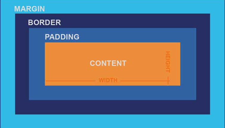
Let’s take look at each layer of the box model:
Content:
- The innermost area containing your actual content.
- Text, images, videos, and other media live in this space.
- The
widthandheightproperties you set apply to this area by default.
Padding:
- This is the space inside the border, surrounding your content.
- Think of it as the box’s personal space, its bubble. It pushes the content away from the border.
- Padding adds to the visual size of your box but is still part of the element itself. It’s transparent by default, taking on the background color of the element.
- Properties:
padding-top,padding-right,padding-bottom,padding-left, or the shorthandpadding.
.my-box {
  background-color: lightblue;
  padding: 20px; /* 20px of space on all sides between content and border */
}
Border:
- This is the line that wraps around the padding (and thus, your content).
- It’s a visible separator between your element and the outside world. You can style its width, style (solid, dashed, etc.), and color.
- Borders add to the total size of the box.
- Properties:
border-width,border-style,border-color, or the shorthandborder.
.my-box {
  border: 2px solid #333; /* A 2px solid dark gray line */
}
Margin:
- This is the space outside the border. It’s the space between your box and its neighbors.
- Think of it as how much your box hates other boxes and needs its personal bubble outside its own existence. Margins collapse (vertically) sometimes, which is another fun surprise CSS will throw at you.
- Margins are always transparent and do not take on the element’s background color. They push other elements away.
- Properties:
margin-top,margin-right,margin-bottom,margin-left, or the shorthandmargin.
.my-box {
  margin: 15px; /* 15px of space around the box, pushing other elements away */
}
Understanding box-sizing
The default box model behavior often confuses developers and leads to layout issues. Understanding box-sizing is crucial for predictable layouts.
box-sizing: content-box; (The Default Behavior)
When you set width: 200px; with the default content-box, that 200px applies only to the content area. Adding padding: 20px; and border: 5px solid black; creates a total element width of:
200px (content) + 20px (left padding) + 20px (right padding) + 5px (left border) + 5px (right border) = 250px
This means your element is actually 250px wide, not the 200px you intended. This counter-intuitive behavior causes layouts to break, elements to overflow containers, and makes responsive design much more difficult.
box-sizing: border-box; (The Preferred Approach)
With border-box, when you set width: 200px;, that measurement includes the content, padding, and border. The content area shrinks to accommodate the padding and border, but the overall element remains exactly 200px wide.
So, if you set width: 200px;, padding: 20px; and border: 5px solid black;, your total element width will actually be 200px. The content area will shrink to accommodate the padding and border, but the overall visible width of your box remains exactly what you told it to be.
Why this matters: The math becomes intuitive. You define the outer dimensions, and everything else fits neatly inside. This makes building complex layouts, especially with percentages or responsive designs, infinitely simpler and more predictable. It prevents unexpected overflow and ensures your grids actually add up.
The Universal Box-Sizing Fix: Apply this globally so every element behaves predictably. Add this to the top of your main CSS file:
/* Universal box-sizing rule */
*,
*::before,
*::after {
  box-sizing: border-box;
}
This single rule prevents countless layout issues and makes CSS much more intuitive to work with. It’s considered a best practice and should be included in every project. Most CSS frameworks and resets include this rule by default.
Modern CSS Layout: Beyond the Hacks
Now that you understand specificity and the box model, let’s tackle the area where CSS truly shines: creating flexible, responsive layouts.
The reason many websites look dated isn’t just poor design, it’s often because developers are still using weird, outdated layouts.
Legacy Layout Methods
Before modern CSS layout tools, developers relied on workarounds that were never intended for complex layouts. float was originally designed to wrap text around images, not create entire page layouts. position: absolute offered precise placement but at the cost of responsive behavior and maintainability.
These methods required extensive hacks, browser-specific fixes, and careful management of element relationships. Building responsive layouts was challenging, and maintaining them was even more difficult.
/* How we used to build columns, and why we cried */
.left-column {
  float: left;
  width: 30%;
}
.right-column {
  float: right;
  width: 65%;
}
.clearfix {
  /* Because we needed this ugly hack everywhere */
  clear: both;
}
Then there was position: absolute;. You’d slap position: absolute; on an element, give it top: 20px; left: 50px;, and watch it sit exactly where you wanted it. Until you resized the browser, added more content, or someone with a different screen resolution looked at it. Then it would break.
/* A disaster on different screen sizes */
.hero-text {
  position: absolute;
  top: 100px;
  left: 50%; /* Just try to center this consistently */
  transform: translateX(-50%); /* Don't even ask */
}
These days, CSS comes with layout tools that solve these problems out of the box. Flexbox and CSS Grid are the standards now for layout work.
Flexbox: The One-Dimensional Savior
If you take nothing else from this article, take this: Flexbox is for laying things out in a single row or a single column. That’s it. One dimension. Horizontal OR Vertical. Not both simultaneously. If you need to arrange items in a complex grid-like structure (rows and columns), you use Grid (which we’ll cover next). But for anything that needs to flow in a line – a navigation bar, a row of cards, aligning items vertically within a section – Flexbox is your champion.
When you use Flexbox, you’re dealing with two main components:
- The Flex Container: This is the parent element where you apply
display: flex;(ordisplay: inline-flex;). All its direct children become “flex items.” - The Flex Items: These are the direct children of the flex container. They automatically become flexible and responsive.
Once you declare display: flex; on a container, two invisible axes appear:
- Main Axis: This is the primary direction in which your flex items are laid out. By default, it’s horizontal (left-to-right).
- Cross Axis: This is perpendicular to the main axis. If your main axis is horizontal, your cross axis is vertical (top-to-bottom).
You’ll control how items behave along these axes using various properties.
Essential Flexbox Properties
Apply these to the Flex Container:
display: flex;(ordisplay: inline-flex;)Purpose: The magic switch. Turns an element into a flex container and makes its direct children flex items.
Example:
<nav style="display: flex;">
  <a>Home</a>
  <a>About</a>
  <a>Contact</a>
</nav>
The links will now try to sit in a single row.
flex-directionPurpose: Defines the direction of the main axis (row or column).
Values:
row(default): Items lay out horizontally (left to right).row-reverse: Items lay out horizontally, but from right to left.column: Items lay out vertically (top to bottom).column-reverse: Items lay out vertically, but from bottom to top.
Example:
.menu {
  display: flex;
  flex-direction: column; /* Items will stack vertically */
}
justify-contentPurpose: Controls the alignment of flex items along the main axis. This is where you distribute space between/around items.
Values: -
flex-start(default): Items pack to the start of the main axis.flex-end: Items pack to the end of the main axis. -center: Items center along the main axis.space-between: Items are evenly distributed; first item at the start, last at the end.space-around: Items are evenly distributed with equal space around them.space-evenly: Items are distributed so that the spacing between any two items (and the space to the edges) is equal.
Analogy: If your items are friends lining up for a photo (
flex-direction: row)justify-contentis how they spread out or huddle togetherflex-start: All huddle at the left.center: All huddle in the middle.space-between: First one far left, last one far right, others spread evenly in between
Example:
.nav-bar {
  display: flex;
  justify-content: space-between; /* Spreads nav links evenly */
}
align-itemsPurpose: Controls the alignment of flex items along the cross axis. This is about vertical alignment if
flex-directionisrow, or horizontal ifflex-directioniscolumn.Values:
stretch(default): Items stretch to fill the container along the cross axis (if no height/width is set on the item).flex-start: Items align to the start of the cross axis.flex-end: Items align to the end of the cross axis.center: Items center along the cross axis.baseline: Items align their baselines.
Analogy: Still with our friends for the photo (
flex-direction: row):align-itemsmakes sure the tall guy doesn’t block the short guy vertically.flex-start: Everyone aligns to the top.center: Everyone aligns to the vertical middle.flex-end: Everyone aligns to the bottom.
Example:
.card-container {
  display: flex;
  align-items: center; /* Vertically centers items in the row */
  height: 300px; /* Needs a defined height for align-items to be obvious */
}
flex-wrapPurpose: By default, flex items will try to fit onto a single line. This property controls whether items wrap to the next line or not.
Values:
nowrap(default): All items stay on one line, potentially overflowing.wrap: Items wrap onto multiple lines.wrap-reverse: Items wrap onto multiple lines, but in reverse order.
Example:
.tags {
  display: flex;
  flex-wrap: wrap; /* Allows tags to break to next line if space runs out */
}
gap(orrow-gap,column-gap)Purpose: Creates a consistent gap between flex items. Bless this property, it’s a modern savior.
Example:
.image-gallery {
  display: flex;
  flex-wrap: wrap;
  gap: 20px; /* 20px space between all images */
}
Properties for Flex Items (For the children of the Flex Container)
flex-growPurpose: Defines the ability of a flex item to grow if necessary. It takes a unitless value (0 or higher). If all items have
flex-grow: 1;, they’ll grow equally.Example:
.item-1 {
  flex-grow: 1;
} /* Grows to take up remaining space */
.item-2 {
  flex-grow: 2;
} /* Grows twice as much as item-1 */
flex-shrinkPurpose: Defines the ability of a flex item to shrink if necessary. Default is
1.0prevents shrinking.Example:
.logo {
  flex-shrink: 0;
} /* Prevents the logo from shrinking */
flex-basisPurpose: Defines the default size of an element before any shrinking or growing occurs. Can be a length (
200px) or a percentage (30%).Example:
.product-card {
  flex-basis: 300px;
} /* Tries to be 300px wide initially */
flex(Shorthand forflex-grow,flex-shrink,flex-basis)Purpose: The ultimate shorthand.
flex: 1 1 auto;is common (grow 1, shrink 1, basis auto).flex: 1;is shorthand forflex: 1 1 0%;.Example:
.main-content {
  flex: 1;
} /* Grows to fill available space */
.sidebar {
  flex: 0 0 250px;
} /* Doesn't grow, doesn't shrink, stays 250px wide */
align-selfPurpose: Overrides the
align-itemsvalue for a single flex item.Values: Same as
align-items(flex-start,flex-end,center,stretch,baseline).Example:
.specific-item {
  align-self: flex-end; /* This item will align to the bottom, regardless of container's align-items */
}
Flexbox Froggy is a goated interactive game for these concepts.
CSS Grid: Two-Dimensional Layout Mastery
Grid is for two-dimensional layouts unlike Flexbox’s single dimension approach, since it allows you to work with both rows and columns simultaneously. When you need precise control over both horizontal and vertical positioning, Grid is the right tool.
Grid Fundamentals
Like Flexbox, Grid operates on a container-item relationship:
- Grid Container: The parent element where you apply
display: grid;(ordisplay: inline-grid;). Its direct children become “grid items.” - Grid Items: The direct children of the grid container. They’re placed within the grid cells you define.
Once you display: grid; on a container, you essentially create an invisible grid framework.
Essential Grid Properties
Apply these to the Grid Container:
display: grid;(ordisplay: inline-grid;)Purpose: Again, the magic switch. Transforms an element into a grid container, enabling all grid layout properties for its direct children.
Example:
<div class="page-layout" style="display: grid;">
  <header>...</header>
  <aside>...</aside>
  <main>...</main>
  <footer>...</footer>
</div>
This div is now a grid canvas.
grid-template-columnsPurpose: Defines the columns of your grid. You specify the width of each column.
Values: Can be fixed units (
px,em,rem), percentages (%), or the gloriousfrunit.frunit (Fractional Unit): It represents a fraction of the available space in the grid container.1fr: Takes up 1 part of the available space.2fr: Takes up 2 parts of the available space (twice as much as1fr).
repeat()function: A lifesaver for repeating patterns.repeat(3, 1fr)creates three 1fr columns.repeat(auto-fit, minmax(200px, 1fr))is for responsive, auto-filling grids (more advanced, but bookmark this!).
Example:
.gallery {
  display: grid;
  grid-template-columns: 200px 1fr 2fr; /* Col 1: fixed 200px. Col 2: 1 part of remaining space. Col 3: 2 parts of remaining space. */
}

.responsive-cols {
  display: grid;
  grid-template-columns: repeat(
    auto-fit,
    minmax(250px, 1fr)
  ); /* Creates columns that are at least 250px, and fill remaining space */
  gap: 20px;
}
grid-template-rowsPurpose: Defines the rows of your grid. Similar to
grid-template-columns, but for height.Values: Same as
grid-template-columns(fixed, %,fr).Example:
.dashboard {
  display: grid;
  grid-template-rows: 100px auto 50px; /* Row 1: 100px height. Row 2: auto height. Row 3: 50px height. */
}
gap(orgrid-gap,row-gap,column-gap)Purpose: Specifies the spacing between grid rows and columns. Exactly like Flexbox
gap.Example:
.product-grid {
  display: grid;
  grid-template-columns: repeat(3, 1fr);
  gap: 15px; /* 15px space between all grid cells */
}
justify-itemsPurpose: Aligns grid items along the row axis (horizontally) within their grid cells.
Values:
start,end,center,stretch(default).Example:
.grid-container {
  display: grid;
  grid-template-columns: repeat(3, 100px);
  justify-items: center; /* All items horizontally center within their 100px cells */
}
align-itemsPurpose: Aligns grid items along the column axis (vertically) within their grid cells.
Values:
start,end,center,stretch(default).Example:
.grid-container {
  display: grid;
  grid-template-rows: repeat(2, 100px);
  align-items: end; /* All items vertically align to the bottom of their 100px cells */
}
justify-content(Applied to the Grid Container)Purpose: Aligns the entire grid horizontally within the grid container. Useful when the grid isn’t filling 100% of the container.
Values:
start,end,center,space-between,space-around,space-evenly.Example:
.outer-wrapper {
  display: grid;
  grid-template-columns: repeat(3, 100px); /* Grid is 300px wide */
  width: 500px; /* Container is 500px wide */
  justify-content: center; /* Centers the 300px grid within the 500px container */
}
align-content(Applied to the Grid Container)Purpose: Aligns the entire grid vertically within the grid container. Useful when grid rows aren’t filling 100% of the container’s height.
Values:
start,end,center,space-between,space-around,space-evenly.Example:
.outer-wrapper {
  display: grid;
  grid-template-rows: repeat(2, 100px); /* Grid is 200px tall */
  height: 400px; /* Container is 400px tall */
  align-content: center; /* Centers the 200px grid within the 400px container */
}
Properties for Grid Items (Applied to the children of the Grid Container)
grid-column-start,grid-column-end(or shorthandgrid-column)Purpose: Specifies which column line a grid item starts and ends on, allowing it to span multiple columns.
Values: Line number (e.g.,
1,3),span [number](e.g.,span 2),span [name](if you name grid lines).Example:
.item-a {
  grid-column-start: 1;
  grid-column-end: 3; /* Item starts at line 1, ends at line 3 (spans 2 columns) */
}
/* Shorthand */
.item-b {
  grid-column: 2 / span 2; /* Starts at line 2, spans 2 columns */
}
grid-row-start,grid-row-end(or shorthandgrid-row)Purpose: Specifies which row line a grid item starts and ends on, allowing it to span multiple rows.
Values: Same as column properties.
Example:
.sidebar {
  grid-row: 1 / span 3; /* Sidebar starts at row 1, spans 3 rows */
}
grid-areaPurpose: The ultimate shorthand for placing an item by its start/end row/column lines, or by named grid areas (more advanced, but super powerful for full page layouts).
Values:
row-start / column-start / row-end / column-endExample:
.header {
  grid-area: 1 / 1 / 2 / 5;
} /* Spans row 1 to 2, col 1 to 5 */

/* Or, with named areas (defined on container with grid-template-areas) */
.header {
  grid-area: header;
}
justify-self- Purpose: Aligns a single grid item horizontally within its own grid cell, overriding
justify-itemsfrom the container. - Values:
start,end,center,stretch(default).
- Purpose: Aligns a single grid item horizontally within its own grid cell, overriding
align-self- Purpose: Aligns a single grid item vertically within its own grid cell, overriding
align-itemsfrom the container. - Values:
start,end,center,stretch(default).
- Purpose: Aligns a single grid item vertically within its own grid cell, overriding
Modern Layout: The Clear Choice
With Flexbox and Grid available, there’s no reason to rely on legacy layout methods. Flexbox handles one dimensional arrangements, while Grid handles two-dimensional layouts. Both have great browser support and are faster to learn than the weird workarounds legacy methods used.
Important Layout Considerations
Combining Flexbox and Grid: These tools complement each other perfectly. You can use a Grid container for your overall page layout, then use Flexbox within individual grid items. For example: Grid handles your main page structure (header, sidebar, content, footer), while Flexbox arranges items within your header (logo, navigation, search bar). This combination gives you precise control on interfaces.
Responsiveness is Built-In (Mostly): Flexbox and Grid are inherently designed for responsiveness.
flex-wrapin Flexbox is a lifesaver for making items automatically flow to the next line.- The
frunit andrepeat(auto-fit, minmax())in Grid are great for creating grids that adapt to different screen sizes without writing tons of media queries. - Media Queries: You’ll still use media queries (
@media screen and (max-width: 768px) { ... }) to change your Flexbox or Grid properties at different breakpoints (e.g., switchflex-directionfromrowtocolumnon mobile, or changegrid-template-columnsfrom3fr 1frto1fron smaller screens). But they’re a lot easier to manage with these modern layout systems.
Accessibility and Order:
- Visual Order vs. Source Order: With Flexbox’s
orderproperty (order: 1;) and Grid’s explicit placement (grid-column), you can visually reorder items on the screen. However, this does NOT change their order in the HTML source code. Screen readers read the source order. If you drastically change the visual order, you can create a confusing or unusable experience for users who rely on assistive technologies. Useordersparingly and with caution. - Logical Flow: Always strive for a logical HTML source order, and use CSS for visual presentation. Don’t rely on
orderto fix a poorly structured HTML document.
- Visual Order vs. Source Order: With Flexbox’s
Browser Dev Tools are Your Best Friends (Literally): Browser aren’t all so evil, their developer tools have somewhat decent visual inspectors for Flexbox and Grid. Just explore around, you’ll find something useful.
Performance Implications: While generally performant, complex Flexbox or Grid layouts with many items and frequent re-calculations can still have a minor impact. Stick to properties that avoid “layout thrashing” (like
transformfor animations, as mentioned previously). Most of the time, the performance gains from simpler, more efficient layout code far outweigh any minor overhead.
Just like Flexbox Froggy, Grid Garden is an excellent interactive way to practice CSS Grid concepts.
Work with these layout tools, and you’ll create more maintainable, responsive, and elegant layouts than legacy methods ever allowed. Don’t want to overload you with TMI for now, so I’ll put the rest of the CSS stuff in the next part.
See you around, learner :)